Our Perception Of Colour
Tuesday, November 23, 2010
When I first started as a photographer in 1975 in Vancouver I tried to be ahead of the pack. I tried to learn to do what other photographers I competed with were not doing. I attempted to print my own colour negatives as I considered myself a very good printer of b+w negatives. This attempt failed until my smart wife Rosemary told me one day, “I have signed you up for a colour printing course at Ampro Photo Workshops. And that is how I learned to print colour negatives and slides. My bête noir was a lovely red haired Canadian Pacific stewardess who asked me to take her portraits. It was one of my first attempts at “safe” glamour portraits. While the attempt pleased the stewardess in question I never made any money as I spent days trying to get prints that showed her brilliant red hair and yet at the same time that luminous white skin that people of her kind so often have. I failed not knowing that the real problem was a failure of the Kodak film stock to accommodate what at the time we called the magenta/green shift. This meant that by making the hair redder the skin would develop a blue/cyan/green cast. If I tried to make the skin colour neutral the hair would fade in brilliance. Accurate pictures of red haired people would have to wait for the digital revolution that would usher in what photographers who know call a proper white (or custom) white balance.
But Rosemary’s role in my learning to print colour has especially served me well now when I scan my negatives and slides or try to colour correct my iPhone snaps. The understanding in the balancing of colour in a colour negative is crucial to the correcting of digital pictures be they files from digital cameras or digital files (as is my case) from scanned colour material.
Even the scanning of b+w prints and negatives involves colour. My scanner, unless told otherwise, will scan all b+w material in four colours (cyan/red, yellow/blue and magenta/green plus black density). This means that every picture you see in my blog even when it is supposed to be b+w will have some sort of colour cast that I purposely inject, vary and modify. The colour cast will vary for viewers as not all monitors (in fact few) are ever properly colour calibrated.
An example can be the cast of the three b+w pictures here of Argentine Tango dancer Mariela Franganillo. From the moment I saw her dance when she came to Vancouver in 1997 as part of the traveling troupe Forever Tango I thought she was hot stuff. I could have scanned these two negatives and one of the prints (the one with the filed edges) and given it a warmer red/yellow cast. But here I decided that a cool approach would render the pictures as a cool slow burn! On the other hand you can disagree by having a look at the warm alternative and make up your mind.
 |
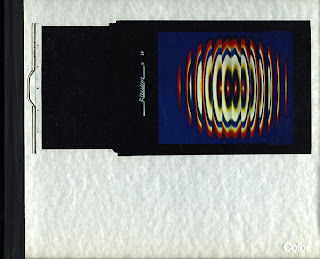
| Life Library of Photography - Color |
For those who might want to investigate this phenomenon of colour shifts I would recommend from the still available (if you look in good used book stores) Color from the venerably famous series Life Library of Photography. On page 14 and 15 you will discover (as I am forewarning you!) that blue and cyan can be problematic. Photographic blue is purplish in tint and cyan is a green blue. For me the best definition for cyan is the sky over the North Vancouver mountains in late August when you can see winter coming in its inevitability. It is an icy cold blue. That's cyan. It is because of these strange photographic colours that those who know might tint portraits of our prime minister in a greenish cyan and make us dislike him without us being aware to the why!
The Funky Redhead


